Label Studio
Drag & drop editor for designing custom label layouts. Add text, barcodes, images, tables and dynamic fields, then print or export to PDF.
Interface overview

The interface is organized into three main areas:
- Tools Panel (left) — Contains the drawing tools and the list of elements placed on the label in a tree structure. Click an element to select it directly.
- Canvas (center) — The workspace where you position and edit components. The horizontal and vertical rulers show measurements in millimeters.
- Properties Panel (right) — Displays the properties of the selected component: position, dimensions, formatting, colors, linked data.
The label size on the canvas matches exactly what will be printed. Set the correct format from Sheet & Label Format before starting the design.
Main menu
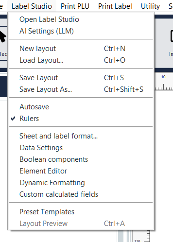
The Label Studio menu in the top bar contains all main operations:
- New layout (Ctrl+N) — Creates an empty layout
- Load Layout... (Ctrl+O) — Opens a saved layout
- Save Layout (Ctrl+S) — Saves the current layout
- Save Layout as... (Ctrl+Shift+S) — Saves with a new name
- Autosave — Enable/disable automatic saving
- Rulers — Show/hide rulers at the canvas edges
- Sheet & Label Format... — Configure sheet dimensions, label size and margins
- Data Settings — Manage data profiles and global fields
- Boolean Components — Manage visibility conditions for components
- Element Editor — Quick assignment of data fields to elements
- Dynamic Formatting — Automatic highlighting of keywords
- Custom Calculated Fields — Formulas for dynamic calculations
- Predefined Templates — Layout preset management
- Layout Preview (Ctrl+A) — Shows the PDF preview of the layout
Enable Autosave to avoid losing your work. The layout is saved automatically after every significant change.
Available tools
The toolbar on the left contains all the components that can be added to the label. Click a tool, then click on the canvas to place the component.
- Select — Selection and component movement tool (active by default)
- Testo semplice — Text with basic formatting (font, size, color, alignment)
- Testo avanzato — Rich text editor with advanced formatting (bold, italic, lists, multiple styles in the same box)
- Barcode 1D-2D — Linear barcodes (Code 128, EAN, UPC) and 2D (QR Code, Data Matrix, PDF417) with over 100 symbologies available
- Forme — Rectangles, circles, ellipses and polygons with fill color, border and corner radius
- Linea — Straight lines with dashed style, thickness and optional arrows
- Immagine — Insert images from file (PNG, JPG, SVG) with proportional scaling
- Ora — Current time display with customizable format
- Data — Date display with customizable format
- Layout Dinamico — Containers for responsive layouts
- Tabella — Structured tables with headers, columns and formatting
- Prezzo — Price component with currency formatting and separators
- Prezzi Odoo — Multi-price table with Odoo price list support
The detailed configuration of each component (properties, advanced options) will be covered in the dedicated guides for each component.
Working with the canvas
Zoom and navigation
Navigate the canvas with these controls:
- Zoom — Ctrl + mouse wheel to zoom in/out. Double-click with Ctrl for 50% zoom. Available levels from 20% to 800%.
- Pan — Middle mouse button to drag the canvas. Alternatively, Alt + left click.
- Scroll — Mouse wheel for vertical scrolling. Alt + wheel for horizontal scrolling.
Rulers and guides
The rulers show measurements in millimeters along the canvas edges. Guides are reference lines useful for aligning components.
- Create a guide — Drag from the horizontal or vertical ruler towards the canvas
- Move a guide — Drag the guide to the new position
- Delete a guide — Right-click on the guide → Delete guide, or drag it off the canvas
- Lock guides — Prevents accidental movement
- Guides always on top — Guides remain visible above components
Grid and snap
The grid helps position components with precision.
- Show Grid — Show/hide the grid on the canvas
- Snap to Grid — Components automatically align to grid points when you move them
- Edit Grid... — Customize grid dimensions
Enable Snap to Grid when working with labels that require precise alignment. Disable it for free positioning.
Clean view
Press Ctrl+H to activate the clean view: hides all selection handles, dashed outlines and anchors. Useful for checking the final appearance of the layout without visual distractions.
Component operations
Select and move
- Single selection — Click on the component
- Multiple selection — Ctrl + click on each component to add to the selection
- Lasso selection — Shift + drag to select all components in the area
- Move — Drag the selected component to the new position
- Resize — Drag the handles (blue squares) at the component edges
Copy, paste and duplicate
Use Ctrl+C to copy and Ctrl+V to paste. The pasted component is positioned with a 2mm offset from the original to avoid overlapping.
When you paste a component linked to a data field, the link is preserved. Edit the data field in the properties panel if the new component should display different data.
Lock and hide
- Lock — Prevents accidental movement and resizing. The padlock icon appears in the element tree.
- Hide component — The component becomes invisible in the editor but remains in the layout.
Hidden components are still printed in the final PDF. To exclude a component from printing, use Disable component instead of Hide.
Stacking order
When components overlap, the order determines which appears on top:
- Bring to front — Brings the component above all others
- Send to back — Sends the component behind all others
Copy and paste style
To apply the same formatting to multiple components without configuring them one by one:
- Select the component with the desired style
- Right-click → Copy style
- Select the target component
- Right-click → Paste Style
Copy style transfers fonts, colors, borders and formatting. Use this feature when creating labels with a uniform appearance.
Context menus
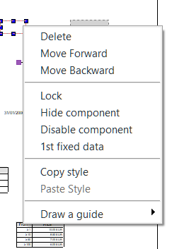
Canvas menu
Right-click on a component in the canvas:
- Delete — Removes the component
- Bring to front / Send to back — Changes the stacking order
- Lock — Lock/unlock the component
- Hide component — Hide/show the component
- Disable component — Disables the component (will not be printed)
- Fixed data 1 — Assigns fixed data to the component
- Copy style / Paste Style — Copy or apply formatting
- Draw guide — Creates a guide aligned to the component (submenu with options)
Elements panel menu
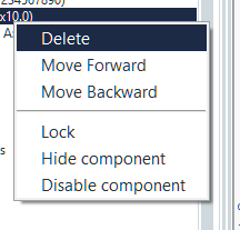
Right-click on an element in the tree on the left:
- Delete — Removes the element
- Bring to front / Send to back — Changes the order
- Lock — Lock/unlock
- Hide component — Hide/show
- Disable component — Disable (not printed)
Component grouping

Grouping allows you to treat multiple components as a single unit. Select the components to group (Ctrl+click), then use Create Group from the context menu or toolbar.
- Unified movement — When dragging the group, all components move while keeping their relative positions
- Edit Group — Edit the group properties
- Ungroup — Separates the group components, making them independent again
Group components that form a logical unit (e.g. 'Weight:' label + weight value). This way you can move, lock or hide them all together.
Alignment and distribution
Alignment

The Alignment tab aligns selected components relative to the label margins. The 3×3 grid offers 9 alignment positions: top-left, top-center, top-right, center-left, center, center-right, bottom-left, bottom-center, bottom-right.
Works with one or more selected components.
Distribution
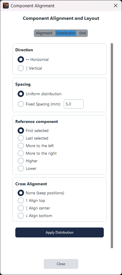
The Distribution tab arranges components with uniform or fixed spacing:
- Direction — Horizontal or vertical
- Spacing — Uniform distribution (equidistant) or fixed spacing in mm
- Reference component — First selected, last, leftmost, etc.
- Cross alignment — How to align components on the perpendicular axis
Grid arrangement
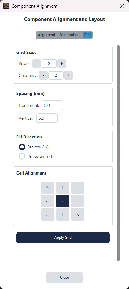
The Grid tab arranges components in a regular grid:
- Rows and Columns — Number of rows and columns
- Spacing — Horizontal and vertical distance between cells in mm
- Fill direction — By row or by column
- Cell alignment — Component position within each cell (3×3 grid)
Select at least 2 unlocked components to use alignment and distribution. Locked components are ignored.
Sheet and Label Format
Sheet format
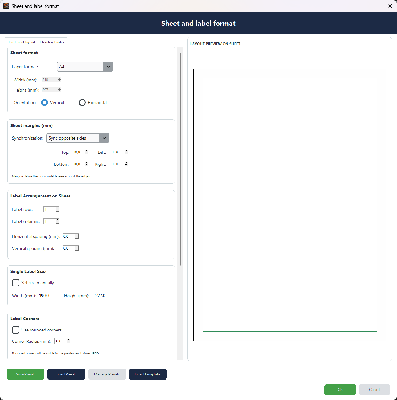
The Sheet & Label Format window configures the print media dimensions and the label arrangement on the sheet.
- Paper format — Standard formats (A4, Letter, Legal, etc.) or custom dimensions in mm
- Orientation — Portrait or landscape
- Sheet margins — Top, bottom, left, right margins. Enable synchronization for uniform margins.
- Label arrangement — Number of rows and columns of labels per sheet
- Spacing — Horizontal and vertical distance between labels
- Label size — Calculated automatically or set manually
- Rounded corners — Rounded edges for the label
The preview on the right shows the label arrangement on the sheet in real time. Verify that the configuration matches the physical media you will use for printing.
Templates and presets
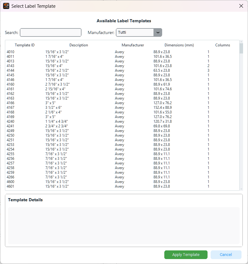
To get started quickly, load a predefined template from Load Template. The library includes over 40 commercial formats (Avery, Herma, etc.) with dimensions and layouts already configured.
You can also save your custom configurations as presets with Save Preset to reuse them in the future.
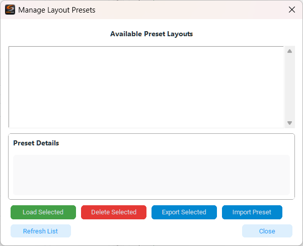
The Preset Management window allows you to load, delete, export and import layout presets.
Data Settings
Data profiles
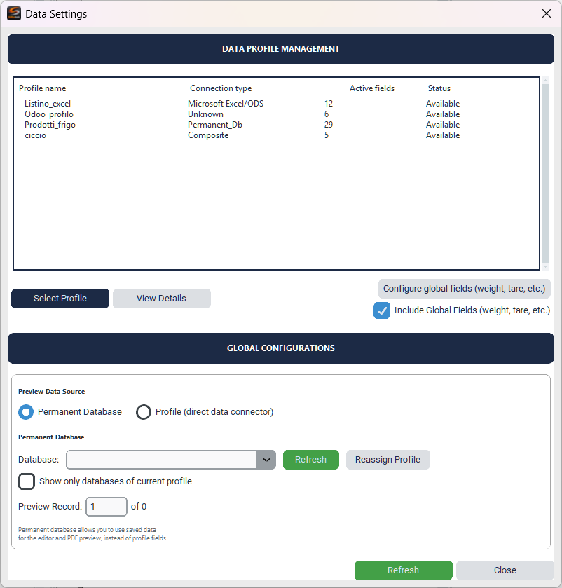
The Data Settings window manages the source profiles for label variable data. Each profile corresponds to a data connection (Excel, CSV, database, Odoo).
- Select Profile — Chooses the active profile for the current layout
- View Details — Shows the fields available in the profile
- Permanent Database — Uses data saved locally in the application database
- Direct profile — Connects directly to the source file or database
Global fields
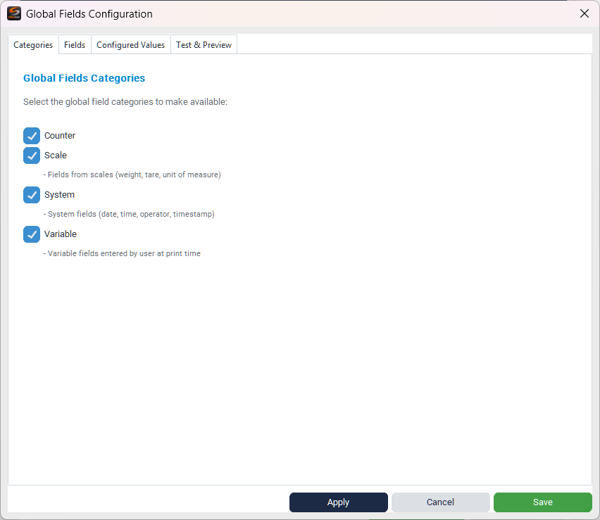
Global fields are data that do not come from the data profile but from the system environment or the user:
- Counter — Progressive counters (global, session, batch)
- Scale — Data from the connected scale (gross weight, tare, net weight, unit of measurement)
- System — System information (date, time, timestamp, operator)
- Variable — Fields entered manually by the user before printing (e.g. batch, expiry date)

In the Specific Fields tab you can individually enable/disable each field and view its type, category and description.
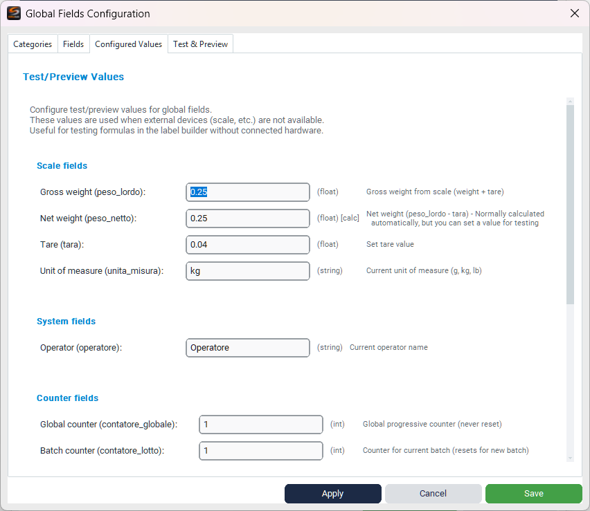
The Test/Preview Values tab allows you to enter test values for global fields. These values are used in the PDF preview when no hardware is connected (e.g. scale) or real data is available.
Scale fields (weight, tare, unit of measurement) require a physical scale connected to work during actual printing. In preview mode, the test values configured here are used.
Custom calculated fields

Calculated fields allow you to create derived values using Excel-style formulas. For example, you can calculate a discounted price, a total with VAT, or format text based on conditions.
- Field name — Unique identifier for the calculated field
- Formula (Excel-like) — The calculation formula. Use field names in square brackets as references.
- Output type — Auto (automatic detection), Number or Text
- Decimal places — Number of decimals for numeric values
- Fields available for the formula — The table below shows all available fields from data profiles that can be inserted into the formula
Practical example: to calculate a 10% discounted price, use the formula [prezzo] * 0.9. For a total with 22% VAT: [prezzo] * 1.22
Element Editor and Dynamic Formatting
Template value editor
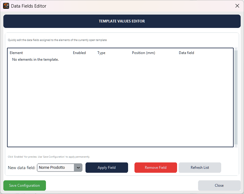
The Template Value Editor allows you to quickly assign or modify the data fields linked to each label element, without having to open the properties of each component individually.
- Element — Name of the component in the label
- Data field — The linked data profile field
- Apply Field / Remove Field — Assigns or removes the data link
Dynamic formatting
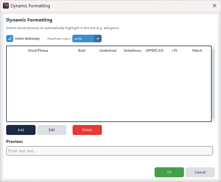
Dynamic formatting automatically highlights specific words or phrases in the text. Define a dictionary of words to highlight and the system formats them automatically when they appear in the data.
- Active dictionary — Enable/disable automatic formatting
- Match — Predefined or partial
- Per-word options — Bold, Underline, Strikethrough, UPPERCASE, font size increase
- Preview — Test the formatting with sample text
Ideal feature for food labels: add allergens to the dictionary (gluten, lactose, eggs, etc.) and they will be automatically highlighted in bold in the ingredients text, as required by regulations.
PDF Preview
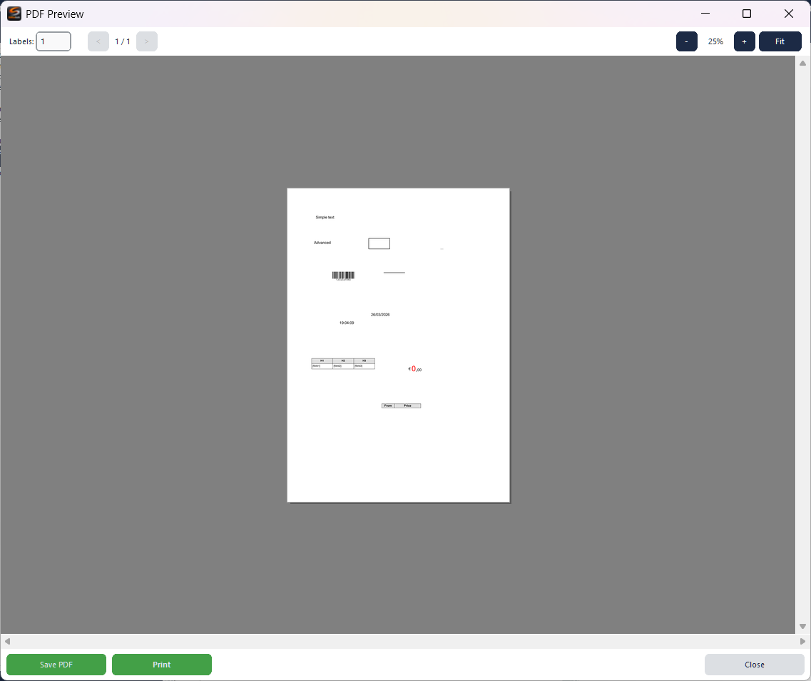
The PDF preview (Ctrl+A) shows the exact result that will be printed.
- Labels — Number of copies to generate
- Navigation — Previous/next page
- Zoom — Zoom in, zoom out, fit to window
- Save PDF — Export the layout as a PDF file
- Print — Send directly to the printer
The preview includes all components, even those hidden in the editor. Disabled components, however, are not printed. Use the preview to verify the result before printing on physical media.
Keyboard shortcuts
Summary of available shortcuts:
| Action | Shortcut |
|---|---|
| New layout | Ctrl+N |
| Load layout | Ctrl+O |
| Save layout | Ctrl+S |
| Save as | Ctrl+Shift+S |
| PDF Preview | Ctrl+A |
| Copy | Ctrl+C |
| Paste | Ctrl+V |
| Delete | Delete |
| Undo | Ctrl+Z |
| Redo | Ctrl+Y |
| Clean view | Ctrl+H |
| Zoom in/out | Ctrl + mouse wheel |
| Canvas pan | Middle mouse button / Alt+click |
| Multiple selection | Ctrl+click |
| Lasso selection | Shift+drag |
| Cancel operation | Escape |